Wednesday, September 24, 2008

Ideogram-based Languages

What are Ideogram-based languages?
They are languages that use symbols and characters to represent words and ideas without expressing what the actual meaning is. The symbols are not substituting exact words like in logographic writing systems. They are representing the idea and meaning of the word.

Languages where Ideograms are used:
Chinese
Japanese
Korean
Thai


Key Points:
Using words to express abstract ideas

One-one ratio between the symbol and idea

Understanding of meaning without "saying" what it is


The "No Entry" sign, for example, does not need words in order for someone to know what the symbol means


QUESTION:
What is an example of an Ideogram?


sources:
http://www.drhapgood.com/images/NoEntry.jpg
http://www.newton.k12.ma.us/Angier/DimSum/dimsumimages/China%20Caligraphy/words.GIF
http://www.mexconnect.com/amex/kosai/kosai.jpg

Tuesday, September 16, 2008

Fundamentals of Type

➢ Absolute Measurements – measurements of fixed values (points, picas, millimeters). These values cannot be altered.

➢ Relative Measurements – There is no set or absolute size. It is relative or based on the size of type that is being set.

➢ Points - point is a unit of measure that expresses type size and leading. (72 points = 1 inch, 12 points = 1 pica))

➢ Picas – A unit of measure that expresses line length and column width (1 pica = 12 points, 6 picas = 1 inch)

➢ x-Height – the height of the lowercase letters

➢ The Em – a measurement linked to the size of type, to define basic spacing functions.

➢ The En – Unit of measurement equal to half of one em. (72pt font the en would be 36 points). Used to denote nested clauses

➢ Dashes – short horizontal rules that serve various specific functions.

➢ Alignments – position of type within a text block, in both the vertical and horizontal planes.
o Justification - adjustments made to the spaces between text to make the left or right margins line up.
o Flush Left – Text is tight and aligned to the left margin
o Flush Right – Text is tight and aligned to the right margin. Often used for picture captions.

➢ Letterspacing – adds space between letters to open up text

➢ Kerning - removal of space between characters

➢ Tracking – Adjusts the amount of space between letters.

➢ Word Spacing – Adjust the amount of space between words

➢ Widow – A lone word at the end of a paragraph

➢ Orphan – The final one or two words of a paragraph separated from the main paragraph to form a column. (Should be avoided at all costs)

➢ Leading – Space between the lines of text in a text block

➢ Indent – allows some or all of the text lines to be moved in from the margin by a specified amount.

➢ First Line Indent – Text is indented from the left margin in the first line of the second and subsequent paragraphs

➢ Hanging Indent – Indentation from the left or right margin, which affects several text lines. The first line of text is not indented.

Tuesday, September 9, 2008

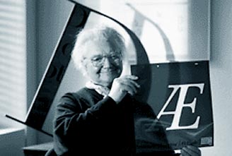
Who is Adrian Frutiger?


Adrian Frutiger is a well-known typographer who was born in Switzerland in 1928. As a child going to school Frutiger rebelled against handwriting taught in school and decided to explore his own unique style of handwriting. He became interested in calligraphy and continued to study the Roman letterforms. In his early years Frutiger was strongly interested in sculpture and graphic design. He started out as a typographer working on logos and designing typefaces. Adrian Frutiger’s typeface became known for the legibility and the ability to deliver messages efficiently. One of the most popular fonts Frutiger designed is Univers. Universe is one of the most famous typefaces around the world. It can be seen everywhere; on keyboards, signage, books, etc. Frutiger spent the majority of his life as a typographer and working on designing different typefaces. He has designed over 170 different fonts, many of which are now standard fonts and are used in daily readings. Adrian Frutiger also created the Frutiger numbering system to eliminate naming. Univers was the first font to use the numbering system. The font consists of two numbers. The first set of numbers describes the weight, and the second set defines the width and position. Adrian Frutiger continues to work on calligraphy, sculpture, woodcarvings, and logos in Switzerland.


Sources:
http://en.wikipedia.org/wiki/Adrian_Frutiger
http://www.kettererkunst.com/bio/adrian-frutiger-1928.shtml
http://typophile.com/node/12118
http://en.wikipedia.org/wiki/Univers
http://www.paratype.com/fstore/default.asp?fcode=445&search=Univers
http://www.typotheque.com/imgs/static/Univers.png
http://editorial.designtaxi.com/news/Frutiger%20Serif%20Pro.jpg

Who is John Baskerville?


John Baskerville was an innovative type designer born in Birmingham, England in 1706. He also had experience in calligraphy and stone cutting. John Baskerville first began his exploration of type after starting his own varnishing business in 1740. In 1750, Baskerville started up his own printing press. Seven years later he published his first book, an edition of Vergil. In 1763, he printed one of his finest works, a folio bible. In 1920, long after his death, Baskerville finally received the recognition he deserved. Baskerville’s types were bought by Beaumarchais and printed by French playwrights. Baskerville’s fonts gained recognition and popularity in the 1920s. He set about improving the William Caslon font. The Baskerville type is known for its balance and clarity. With these strong characteristics the font became a good type to be used in books and long articles. These books were often large and contained wide margins. The Baskerville font is a unique font and is often referred to as a transitional font. The Baskerville font helped make the shift from the older style fonts to the modern fonts a smooth process. Baskerville font has a vertical stress like the modern font type and a lower contrast like the older font styles.


Sources:
http://www.infoplease.com/ce6/people/A0806405.html
http://ilovetypography.com/2007/09/23/baskerville-john/
http://encyclopedia.jrank.org/BAR_BEC/BASKERVILLE_JOHN_1706_1775_.html
http://www.britannica.com/EBchecked/topic/55215/John-Baskerville

Tuesday, September 2, 2008

Why We Use a Grid


Designers use a grid to organize and construct a composition. Grids make areas easier to navigate, work with, and understand, especially in the business world and everyday life.
A grid helps the designer seperate sections of a layout. It allows them to put emphasis on certain parts as well as demphasize things. Grids are useful when determining what you want the viewer to see first as well as how they look at the image as a whole.
By using a grid it eliminates confusion, as well as not allowing it to be scattered and cluttered.

http://www.markboulton.co.uk/articles/detail/why_use_a_grid/
http://en.wikipedia.org/wiki/Grid_(page_layout)