-- what are the following:
Margin - defines the active area of a page and directs the viewer toward the visual elements
Column - vertical divider of space used to align visual elements
Alley - space between characters
Module - spatial areas that support the textual and visual contents of a design
Gutter - inactive, negative spaes that separate one column from the next to prevent textual and visual elements from colliding into each other
Folio - page number
-- What are the advantages of a multiple column grid.?
They contain several spatial intervals which allow for multiple compositional options as well as being flexible and accommodating for a range of visual elements. They also provide opportunities to create rhythm, drama, movement, and tension through the interaction of visual elements.
They are used for complex projects such as books and magazines.
-- Why is there only one space after a period?
characters are proportional; they each take up a proportional amount of space
-- What is a character (in typography)?
an individual element of type such as a letter or punctuation mark
-- How many characters is optimal for a line length? words per line?
around 40 characters per line (70 is too many and 24 is the shortest) or 6 words of 6 characters
-- Why is the baseline grid used in design?
to maintain continuity across the pages of a design
-- What is a typographic river?
Visible Holes
a series of inconsistent word spaces that create distracting open lines running vertically through the justified paragraph
-- What does clotheslining or flow line or hangline mean?
flow lines support vertical columns by dividing a page into horizontal intervals to provide additional alignment points in a grid
-- How can you incorporate white space into your designs?
To create movement within the page and create interesting negative space
-- What is type color/texture mean?
type color - refers to the density of typographic elements and their perceived gray value -- the overall feeling of lightness and darkness on the page.
-- What is x-height, how does it effect type color?
the height of the lowercase letters without ascenders and descenders. Type color is affected by the thickness of the lines or leading
-- Define Tracking:
the typographic technique used to adjust the overall spacing of words, lines, and paragraphs to improve the readable appearance of text.
-- Define Kerning. Why doe characters need to be kerned? What are the most common characters that need to be kerned (kerning pairs)?
used to adjust the slight distances between letters to avoid character collisions, as well as irregular and unwanted spaces.
Ty, Va, 11, and 19
-- In justification or H&J terms what do the numbers: minimum, optimum, maximum mean?
minimum - the minimum number of words that come before or after a hyphen
optimum - allows you to alter word or character spacing within any non-justified paragraphs.
maximum - allows you to adjust the tightness in character spacing. To loosen the spacing enter higher numbers.
-- What is the optimum space between words?
En space
-- What are some ways to indicate a new paragraph. Are there any rules?
Indents (the first paragraph of any text does not require an indent because nothing comes before it)
An extra line length
Typographic Devices (bullets, ornaments, symbols)
Hanging indents
-- What are the rules associated with hyphenation?
only used for hyphenated words
no more than 3 times in a row, or six of the eight lines in a paragraph
never hyphenate a word in a headline
-- What is a ligurature?
a specially designed character produced by combining two or three letters into one unified form
-- What does CMYK and RGB mean?
CMYK - used when preparing for print (cyan, magenta, yellow and black)
RGB - used when preparing for on-screen use (red, green, blue)
-- What does hanging punctuation mean?
it is a slight indent that is visually distracting. It applies to asterisks, apostrophes, commas, en dashes, hyphens, periods, and quotation marks.
-- What is the difference between a foot mark and an apostrophe? What is the difference between
an inch mark and a quote mark (smart quote)?
apostrophes and quote marks are angled or curved and opened or closed, whereas inch and foot marks are straight up and down.
-- What is a hyphen, en dash and em dashes, what are the differences and when are they used.
hyphen - used to link words and breaks syllables of words in text blocks. It is one third of an em rule.
en dash - a punctuation mark used in compound words and to separate items (dates, locations, phone numbers). Also used to separate thoughts when thinking (when used in this way spaces are added before and after the dash).
em dash - a punctuation mark used to separate thoughts within a text. There are no spaces needed before and after, but kerning may be required.
-- What is a widow and an orphan?
widow - one or two words that are left over at the end of the paragraph and should be avoided
orphan - one or two words from the previous spread that start on a new page, which should be corrected to avoid drawing attention to the isolated elements
Saturday, November 22, 2008
Tuesday, November 11, 2008
Helvetica
I never realized how universal the font Helvetica is before watching the movie. As it pointed out Helvetica is everywhere, on signs, labels, posters, billboards, buses, the media, etc. It was fascinating to see how a single font is used so widely and by so many people. It was interesting to see how the designers felt about the font and that many of them didn’t see a way to improve it. I have never thought of Helvetica as such an amazing font because it seems so plain and simple, almost boring. Actually, the font is very recognizable, clear and can work for almost anything. Typography is so important in our world and the font gives the piece of work it is on character and personality.
Monday, November 10, 2008
David Berlow

David Berlow is one of today’s most influential American typographers. His colleagues describe him as a funny, quirky, private guy who shares his experience and knowledge through teaching others. A man who aside from designing many typefaces enjoys “taking time off, collecting rubber bands and counting grains of sand.” He has “witnessed and influenced early developments of digital typography,” co-founded a digital type font company specializing in custom designs, and designed many font designs and font families. David Berlow has made a major impact on typography and has impressed a large audience with what he has brought to the industry.
David Berlow was born in Boston, Massachusetts in 1954 but did not stay there long. He moved to Wisconsin when he was a year old and stayed there until the completion of his schooling. His interest in type began at a young age. Berlow remembers carving block prints at seven years old and became quite fascinated with the ability of repetition, “if I positioned the palm trees just so, and the monkey swung just so I could repeat the same block as many times as I wanted for a longer picture!” He attended college at the University of Wisconsin-Madison from 1973-1976, majoring in fine arts. A letterpress in college sparked his old interests in type. After opening a drawer of type during his freshman year, he discovered the same technique of repeating blocks just like he had when he was seven, and experienced the same excitement he had when he was young. In college at a friend’s request, he designed a logo for a travel agency. His logo was very typographic, and it was the beginning of his fascination with type. After the logo project, Berlow discovered there were many opportunities in graphic design. David Berlow graduated from the University of Wisconsin-Madison and moved to New York.
David Berlow’s first job was with an advertising agency, but he soon decided the New York agency scene was not his style. After two months, he decided the job was not for him. Not sure of what to do next, Berlow put together a plan, “I figured I’d spend a few years drawing letters, a few years learning photo editing and then work as the art director for a music magazine like Rolling Stone or SPIN.” Berlow took action on his plan in 1977 and began applying for several jobs including, Marvel Comics, a diploma factory, and Mergenthaler Linotype New York drawing office. Mergenthaler Linotype, “one of the oldest, still operating type foundries,” stepped up and offered Berlow a job. It wasn’t a very good paying job, but it gave Berlow the opportunity to do what he loved. At Linotype Berlow discovered he could make a living drawing letters all day. While working at Linotype, Berlow considered switching from type to photography but decided to stay with type after realizing his love for drawing alphabets. After four years, he went to work with some colleagues at Bitstream, Inc., a digital type supplier, in Cambridge, Massachusetts. Through his experience and colleagues at Linotype and Bitstream, Berlow learned “the qualities of design and the lines themselves” as well as the digital side of type. From 1982-1989, he worked at Bitstream, designing fonts and working on marketing strategies helping to establish a retail library for Bitstream. Seven years later, David Berlow left Bitstream to begin a new chapter in his career by founding his own company.
In 1989, David Berlow and Roger Black teamed up to form the Font Bureau, located in Berlow’s apartment in Boston. Their objective was simple, “to make fonts that were useful to customers.” Initially these designs were for corporations like Apple, Microsoft and The Chicago Tribune. The Font Bureau soon developed the reputation of, “producing high-quality classic types and outspoken but perfectly constructed display faces.” The Font Bureau was originally located in Berlow’s personal apartment but soon the company expanded. Berlow hired more designers and when meetings with clients began taking place inside his car, Berlow decided it was time to move to a bigger, more private location. Berlow continued to live in his apartment, and although the designers who work at the Font Bureau are from all over the country, they each work from their own home. Over the years the Font Bureau has “developed over 200 typefaces, new designs and revivals for custom clients, the retail market, and equipment manufacturers.” Some of the custom type designs were created for The Chicago Tribune, The Wall Street Journal, Entertainment Weekly, Newsweek, Esquire, Rolling Stone, and Hewlett Packard.
A year after the Font Bureau moved out of Berlow’s apartment, he began taking yearly visits to Martha’s Vineyard, off the coast of Massachusetts. He spent a month at the vineyard and returned a year later. After his third visit to the vineyard, Berlow decided to call it home. Berlow fell in love with the island’s “scenic beauty and rustic charm.” While his house was being built on Martha’s Vineyard, Berlow lived in a dilapidated trailer at the back of his property. Berlow gets his inspiration for his type designs from the trees and landscape at the Vineyard.
Berlow was respected by his colleagues for his outstanding work. In 2007 Berlow won the SOTA Award of the Society of Typographic Aficionados. The Society of Typographic Aficionados is a non-profit society whose goal is to get the word out to the public about the art and history of typography and its function of creating a successful way of communicating. Today, Berlow is the President of the Font Bureau, the Vice President of a new media company, Interactive Bureau, and the organizer for the Type Lab, “a traveling thing on type and typography.” He continues to work on designing new fonts, as well as redesigning old fonts from his home on Martha’s Vineyard. After growing up in small towns and rural areas until the age of 24, Berlow finds the isolation of being on an island a much easier place to concentrate and develop his best ideas than the busy environment of the city.
David Berlow is inspired from art and types from the past, even from centuries ago. He is fascinated with old types and believes that he can learn a great deal from them. The typefaces can give one insight to the people, publications, and places for whom or what the design was created. Over the years, possibly 50 years or hundreds of years, the designs may be redesigned and updated using different technologies. Berlow is intrigued not only with the type designs, but also with how the designs were made and the materials that were used. Many of his type designs are inspired by designs from past centuries. “What is fascinating to me about the type of the past is that they take me to a particular place in time where a type was required to solve some problems,” says David Berlow. David Berlow has learned much from type designers of today and continues learning everyday. He learns from those he is teaching and he learns from other designers at The Font Bureau. These are his “latest teachers” because he learns form the style of today’s type. Berlow learned from his colleagues at Linotype and Bitstream, and he learned much from John Quaranta, the Master Designer at Linotype, when he worked there. David Berlow is influenced and continues to learn from type designers from ages past. He believes, “Type design is pretty much infinite, and all it takes is a letter you’ve never seen before to incite learning.”
David Berlow has his own method when he begins designing a new typeface, “Mostly it’s listening to a need, from a client or the sales department or another designer. Then thinking though the major features, and then drawing until all the details are settled. This is followed by exposure and reaction from customers and potential customers, and then with positive feedback, a new family is drawn.” His greatest tool used to design a new font is the world around him. His first step is to explore the world and “do things that allow him to think better about the letter.” He resorts to the computer when he can “draw these letters!” Instead of starting at the beginning of the alphabet and working his way from A to Z, he starts with the letters H-O-D. He then continues with n-o-p and works his way through all the “lowercase letters with the lightest and blackest styles of roman and italic from a to z.” When analyzing a type, Berlow looks at how well the type works for its purpose. He considers both technical and stylistic aspects. For Berlow, the first step to designing a font is to establish what the client wants to convey, then drawing characters on the computer. When the client likes what he sees, then Berlow works on the 200-300 characters, and 30-40 styles in all the different weights and thicknesses. In 1996, Berlow was commissioned by Monotype Imaging to do research at Plantin Moretus Museum in Antwerp, Belgium and to design an exclusive typeface family based on his research. He designed the Throhand Typeface Family.
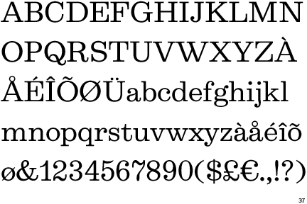
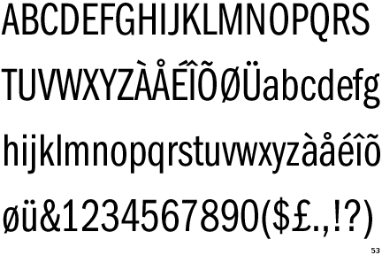
David Berlow designed a variety of fonts including, Agency FB, Agency FB Condensed, Agency FB Wide, Belizio, Belucian, Berlin Sans, FF Berlinsans, Bureau Grotesque Five Three, Bureau Grotesque One Three, Bureau Grotesque Three Seven, Bureau Grotesque Three Three, Californian FB, Californian FB Display, Californian FB Text, Charcoal, Cheltenham FB Bold Condensed, Eagle, Eldorado Display, Eldorado Micro, Eldorado Text, Empire (FB). One of the typefaces Berlow designed is Belizio, 1987. Belizio is based on Aldo Novarese's Egizio typeface, designed in 1955. Belizio is a slab serif font. It is a bold, machine like font with square ended serifs and a geometric impact. Berlow also designed two new variations of the ITC Franklin Gothic font, condensed and compressed. It is a sans serif font with a larger x-height. A couple distinguishing characteristics are the double-story g and the tail on the q. The tail forms from the bottom-center of the q. In the year 1991 when ITC Franklin Gothic was designed the Soviet Union officially ended and the U.S. accidentally bombed an Iraqi bomb shelter.
Belizio
ITC Franklin Gothic Compressed
Sources:
http://www.monotypeimaging.com/ProductsServices/TypeDesignerShowcase/DavidBerlow/Biography.aspx?type=bio1
http://www.myfonts.com/newsletters/cc/200709.html
http://www.identifont.com/find?Name=david+berlow&q=Go
http://www.fonts.com/AboutFonts/DesignerProfiles/DavidBerlow.htm
http://www.stepinsidedesign.com/STEPMagazine/Article/28634
http://findarticles.com/p/articles/mi_qa5326/is_200605/ai_n21390342/pg_1?tag=artBody;col1
http://www.typesociety.org/abouthistory.html
http://www.fontbureau.com/pdf/FB_David_Berlow_Specimens.pdf
Macmillan, Neil. An A-Z of Type Designers. London: Laurence King Publishing, 2006.
Tuesday, October 14, 2008
David Berlow
PART A
- Date and place of birth
Boston 1954
- Training or education
Majored in Fine Arts at the University of Wisconsin-Madison
− Start through designing a logo
− Milestones in their life
1st job: advertising agency (wasn’t for him)
Other jobs: Marvel Comics, a diploma factory, and Mergenthaler Linotype (1978), Bitstream Inc.
Co-Founded The Font Bureau in 1989 with Roger Black
- Where do/did they live
Wisconsin (for school), New York – took a job at an advertising agency (2months), Martha’s Vineyard, Massachusetts
− Founding own company
Font Bureau
− Influences
Psychology, technology, history and the arts
− What he’s doing now
Working on the ITC Franklin Gothic type family for Monotype Imaging
PART B
− List all fonts
Agency FB
Agency FB Condensed
Agency FB Wide
Belizio
Belucian
Berlin Sans
FF Berlinsans
Bureau Grotesque Five Three
Bureau Grotesque One Three
Bureau Grotesque Three Seven
Bureau Grotesque Three Three
Californian FB
Californian FB Display
Californian FB Text
Charcoal
Cheltenham FB Bold Condensed
Eagle
Eldorado Display
Eldorado Micro
Eldorado Text
Empire (FB)
ITC Franklin Gothic Compressed
ITC Franklin Gothic Condensed
Gadget
Giza One Five
Giza One One
Giza One Three
Giza Seven Nine
Meyer Two
Numskill
Phaistos
Rhode Medium Extended
Rhode Medium Normal
Romeo Medium Condensed
Techno
Throhand Ink Italic
Throhand Ink Roman
Throhand Ink Roman (FB)
Throhand Pen Italic
Throhand Pen Roman
Throhand Pen Roman (FB)
Throhand Regular Italic
Throhand Regular Roman
Throhand Regular Roman (FB)
Titling Gothic
Titling Gothic Compressed
Titling Gothic Condensed
Titling Gothic Extended
Titling Gothic Narrow
Titling Gothic Skyline
Truth
Truth Light
Truth Ultra
Village
-Choose 1 -2 fonts
-Classify, examine, and identify 6 distinguishing characteristics
Sources:
http://www.monotypeimaging.com/ProductsServices/TypeDesignerShowcase/DavidBerlow/Biography.aspx?type=bio1
http://www.myfonts.com/newsletters/cc/200709.html
http://www.identifont.com/find?Name=david+berlow&q=Go
http://www.fonts.com/AboutFonts/DesignerProfiles/DavidBerlow.htm
Wednesday, September 24, 2008
Ideogram-based Languages
What are Ideogram-based languages?
They are languages that use symbols and characters to represent words and ideas without expressing what the actual meaning is. The symbols are not substituting exact words like in logographic writing systems. They are representing the idea and meaning of the word.
Languages where Ideograms are used:
Chinese
Japanese
Korean
Thai
Key Points:
Using words to express abstract ideas
One-one ratio between the symbol and idea
Understanding of meaning without "saying" what it is
The "No Entry" sign, for example, does not need words in order for someone to know what the symbol means


QUESTION:
What is an example of an Ideogram?
sources:
http://www.drhapgood.com/images/NoEntry.jpg
http://www.newton.k12.ma.us/Angier/DimSum/dimsumimages/China%20Caligraphy/words.GIF
http://www.mexconnect.com/amex/kosai/kosai.jpg
They are languages that use symbols and characters to represent words and ideas without expressing what the actual meaning is. The symbols are not substituting exact words like in logographic writing systems. They are representing the idea and meaning of the word.
Languages where Ideograms are used:
Chinese
Japanese
Korean
Thai
Key Points:
Using words to express abstract ideas
One-one ratio between the symbol and idea
Understanding of meaning without "saying" what it is
The "No Entry" sign, for example, does not need words in order for someone to know what the symbol means
QUESTION:
What is an example of an Ideogram?
sources:
http://www.drhapgood.com/images/NoEntry.jpg
http://www.newton.k12.ma.us/Angier/DimSum/dimsumimages/China%20Caligraphy/words.GIF
http://www.mexconnect.com/amex/kosai/kosai.jpg
Tuesday, September 16, 2008
Fundamentals of Type
➢ Absolute Measurements – measurements of fixed values (points, picas, millimeters). These values cannot be altered.
➢ Relative Measurements – There is no set or absolute size. It is relative or based on the size of type that is being set.
➢ Points - point is a unit of measure that expresses type size and leading. (72 points = 1 inch, 12 points = 1 pica))
➢ Picas – A unit of measure that expresses line length and column width (1 pica = 12 points, 6 picas = 1 inch)
➢ x-Height – the height of the lowercase letters
➢ The Em – a measurement linked to the size of type, to define basic spacing functions.
➢ The En – Unit of measurement equal to half of one em. (72pt font the en would be 36 points). Used to denote nested clauses
➢ Dashes – short horizontal rules that serve various specific functions.
➢ Alignments – position of type within a text block, in both the vertical and horizontal planes.
o Justification - adjustments made to the spaces between text to make the left or right margins line up.
o Flush Left – Text is tight and aligned to the left margin
o Flush Right – Text is tight and aligned to the right margin. Often used for picture captions.
➢ Letterspacing – adds space between letters to open up text
➢ Kerning - removal of space between characters
➢ Tracking – Adjusts the amount of space between letters.
➢ Word Spacing – Adjust the amount of space between words
➢ Widow – A lone word at the end of a paragraph
➢ Orphan – The final one or two words of a paragraph separated from the main paragraph to form a column. (Should be avoided at all costs)
➢ Leading – Space between the lines of text in a text block
➢ Indent – allows some or all of the text lines to be moved in from the margin by a specified amount.
➢ First Line Indent – Text is indented from the left margin in the first line of the second and subsequent paragraphs
➢ Hanging Indent – Indentation from the left or right margin, which affects several text lines. The first line of text is not indented.
Tuesday, September 9, 2008
Who is Adrian Frutiger?
Adrian Frutiger is a well-known typographer who was born in Switzerland in 1928. As a child going to school Frutiger rebelled against handwriting taught in school and decided to explore his own unique style of handwriting. He became interested in calligraphy and continued to study the Roman letterforms. In his early years Frutiger was strongly interested in sculpture and graphic design. He started out as a typographer working on logos and designing typefaces. Adrian Frutiger’s typeface became known for the legibility and the ability to deliver messages efficiently. One of the most popular fonts Frutiger designed is Univers. Universe is one of the most famous typefaces around the world. It can be seen everywhere; on keyboards, signage, books, etc. Frutiger spent the majority of his life as a typographer and working on designing different typefaces. He has designed over 170 different fonts, many of which are now standard fonts and are used in daily readings. Adrian Frutiger also created the Frutiger numbering system to eliminate naming. Univers was the first font to use the numbering system. The font consists of two numbers. The first set of numbers describes the weight, and the second set defines the width and position. Adrian Frutiger continues to work on calligraphy, sculpture, woodcarvings, and logos in Switzerland.


Sources:
http://en.wikipedia.org/wiki/Adrian_Frutiger
http://www.kettererkunst.com/bio/adrian-frutiger-1928.shtml
http://typophile.com/node/12118
http://en.wikipedia.org/wiki/Univers
http://www.paratype.com/fstore/default.asp?fcode=445&search=Univers
http://www.typotheque.com/imgs/static/Univers.png
http://editorial.designtaxi.com/news/Frutiger%20Serif%20Pro.jpg
Who is John Baskerville?

John Baskerville was an innovative type designer born in Birmingham, England in 1706. He also had experience in calligraphy and stone cutting. John Baskerville first began his exploration of type after starting his own varnishing business in 1740. In 1750, Baskerville started up his own printing press. Seven years later he published his first book, an edition of Vergil. In 1763, he printed one of his finest works, a folio bible. In 1920, long after his death, Baskerville finally received the recognition he deserved. Baskerville’s types were bought by Beaumarchais and printed by French playwrights. Baskerville’s fonts gained recognition and popularity in the 1920s. He set about improving the William Caslon font. The Baskerville type is known for its balance and clarity. With these strong characteristics the font became a good type to be used in books and long articles. These books were often large and contained wide margins. The Baskerville font is a unique font and is often referred to as a transitional font. The Baskerville font helped make the shift from the older style fonts to the modern fonts a smooth process. Baskerville font has a vertical stress like the modern font type and a lower contrast like the older font styles.


Sources:
http://www.infoplease.com/ce6/people/A0806405.html
http://ilovetypography.com/2007/09/23/baskerville-john/
http://encyclopedia.jrank.org/BAR_BEC/BASKERVILLE_JOHN_1706_1775_.html
http://www.britannica.com/EBchecked/topic/55215/John-Baskerville
Tuesday, September 2, 2008
Why We Use a Grid

Designers use a grid to organize and construct a composition. Grids make areas easier to navigate, work with, and understand, especially in the business world and everyday life.
A grid helps the designer seperate sections of a layout. It allows them to put emphasis on certain parts as well as demphasize things. Grids are useful when determining what you want the viewer to see first as well as how they look at the image as a whole.
By using a grid it eliminates confusion, as well as not allowing it to be scattered and cluttered.
http://www.markboulton.co.uk/articles/detail/why_use_a_grid/
http://en.wikipedia.org/wiki/Grid_(page_layout)
Tuesday, August 26, 2008
What is a Logo?
According to Paul Rand:
"A logo is a flag, a signature, an escutcheon, a street sign.
A logo does not sell (directly), it identifies.
A logo is rarely a description of a business.
A logo derives meaning from the quality of the thing it symbolizes,
not the other way around. A logo is less important than the product it signifies; what it represents is more
important than what it looks like.
The subject matter of a logo can be almost anything."
Paul Rand
“the greatest living graphic designer" ~Steve Job, former client of Paul Rand

Paul Rand was born in August 1914, in New York. He attended three schools for his education: Pratt Institute, the Parsons School of Design, and the Art Students League. The influence of the German advertising style and European avant-garde played an important role in Rand’s life and work. Paul Rand’s fame began with the work of page designs and layouts. Rand designed a page layout for Apparel Arts magazine, which led to at Esquire-Coronet magazine. He is most known for his logo designs and contributions to the world of advertising. Rand has designed logos for Westinghouse, IBM, UPS, ABC, and Yale University. One of his most distinguishable designs is the NeXT Computer logo. Rand believed the key to a successful and eye-catching logo was simplicity. Not only did he create graphic art, but also Rand took the time to write several books on design, some of which include, “Thoughts on Design” and “A Designer’s Art”.
Paul Rand was highly thought of by his colleagues and clients. One of his clients called Rand, “the greatest living graphic designer”. He changed the process of advertising and emphasized the importance of an art director. In 1996, Paul Rand died of cancer at the age of 82.
Sources:
http://www.paul-rand.com/books_thoughtsOnDesign.shtml
http://www.areaofdesign.com/americanicons/rand.htm
http://www.rand-paul.com/
Subscribe to:
Posts (Atom)