In Stefan Sagmeister's video he spent the majority of the time talking about other people's designs and how he felt about them or what they did for them. I liked when he talked about the designs that made him happy. From far away they would probably look like any other design found in subways but when looked at up close they are new and funny.
I also watched Theo Jenson and J.J. Abrams video. Theo Jenson's work was pretty fascinating especially the way his pieces moved. J.J. Abrams talked a lot about what inspires him. Mystery seemed to be the key inspiration for his projects.
How Good is Good?
Its interesting how many feelings designs evoke and what all a design can do. Designs can bring up someone's spirits, back up a cause, make places safer, inform people, and raise money.
Saturday, February 7, 2009

Friday, February 6, 2009
Type 2: 10 Commandments of Type and How to Break Them
10 Commandments:
I. Thou shalt not apply more than three typefaces in a document.
II. Thou shalt lay headlines large and at the top of a page.
III. Thou shalt employ no other type size than 8pt to 10pt for body copy.
IV. Remember that a typeface that is not legible is not truly a typeface.
V. Honour thy kerning, so that white space becomes visually equalized between characters.
VI. Thou shalt lay stress discreetly upon elements within text.
VII. Thou shalt not use only capitals when setting vast body copy.
VIII. Thou shalt always align letters and words on a baseline.
IV. Thou shalt use flush-left, ragged-right alignment.
X. Thou shalt not make lines too short or too long.
How to break them:
1. Break the letters imposed by the use of only three typefaces.
2. Let thine eyes be seduced by the hierarchy of type.
3. Do not forsake smaller or bigger sizes.
4. Be seduced into trying new and expressive typefaces.
5. Treat kerning and tracking with total irreverence.
6. Entice the reader to sample the delights of your text.
7. Do not forgo the liberal use of capitals within your text.
8. The Lord designed letterforms to stand side by side, but there is no harm in their being lured away from one another.
9. Yield to the temptation to align text in unusual ways.
10. Lure the reader down unfamiliar paths.
I. Thou shalt not apply more than three typefaces in a document.
II. Thou shalt lay headlines large and at the top of a page.
III. Thou shalt employ no other type size than 8pt to 10pt for body copy.
IV. Remember that a typeface that is not legible is not truly a typeface.
V. Honour thy kerning, so that white space becomes visually equalized between characters.
VI. Thou shalt lay stress discreetly upon elements within text.
VII. Thou shalt not use only capitals when setting vast body copy.
VIII. Thou shalt always align letters and words on a baseline.
IV. Thou shalt use flush-left, ragged-right alignment.
X. Thou shalt not make lines too short or too long.
How to break them:
1. Break the letters imposed by the use of only three typefaces.
2. Let thine eyes be seduced by the hierarchy of type.
3. Do not forsake smaller or bigger sizes.
4. Be seduced into trying new and expressive typefaces.
5. Treat kerning and tracking with total irreverence.
6. Entice the reader to sample the delights of your text.
7. Do not forgo the liberal use of capitals within your text.
8. The Lord designed letterforms to stand side by side, but there is no harm in their being lured away from one another.
9. Yield to the temptation to align text in unusual ways.
10. Lure the reader down unfamiliar paths.
Sunday, February 1, 2009
Type 2 Journal Entry
As I was watching the second part of the Jakob Trollback videos during one of the montages of there work I was thinking, "this is moving really fast." After the video he spoke about one of their montages and how it moved so fast the audience wasn't going to be able to see or understand anything about it. He was right though when he said that when you're trying to get your name out there and sell your work you want to show the agency everything you can do which may mean putting it to fast paced music.
All of the videos moved well with the music it was set to. The music really created a mood with the images being shown with it.
All of the videos moved well with the music it was set to. The music really created a mood with the images being shown with it.
Friday, January 23, 2009
Type 2 Journal Entry

Bruce Mau is a Canadian designer who studied at the Ontario College of Art & Design. He is interested in innovation and creativity. He is very optimistic and is always looking for ways to improve civilization. He has received great recognition for the book S,M,L,XL, which was designed and conceived by Bruce Mau himself. The opportunity of opening his own design studio came along with designing the Zone book series. Bruce Mau Design specializes in book designs, logos, store interiors, signage, landscapes, film, magazines, and museum exhibits. The Zone books are known for their content and flexibility.


42. Remember.
Growth is only possible as a product of history. Without memory, innovation is merely novelty. History gives growth a direction. But a memory is never perfect. Every memory is a degraded or composite image of a previous moment or event. That’s what makes us aware of its quality as a past and not a present. It means that every memory is new, a partial construct different from its source, and, as such, a potential for growth itself.
Graphics Reading 2:
We are constantly hearing how much graphic designers have to deal with clients. Sometimes the clients will love your work and other times it won't be what they are looking for. It is emphasized again in this reading that designers should not take the criticism personally. It is the designer's job to keep in mind and meet the client's goals and get the message across in an effective way.
I found it interesting how important it is for a logo to be able to last and that the most successful logos are the ones that are simple, clear, and unique. Often the most simple shape in a certain color can remind someone of a particular place or object. Its also important when designing a logo to remember that you are trying to represent the company and not show everything the company does.
I found it interesting how important it is for a logo to be able to last and that the most successful logos are the ones that are simple, clear, and unique. Often the most simple shape in a certain color can remind someone of a particular place or object. Its also important when designing a logo to remember that you are trying to represent the company and not show everything the company does.
Monday, January 19, 2009
Graphics Reading 1:
When designing a logo or symbol its important to look at it from all different view points and realize everyone may look at it differently. Symbols can be interpreted in many different ways because not everyone thinks or looks at something the same way. Its important to keep an open mind and not just look at it from your own perspective.
I didn't realize how many different things needed to be considered before designing a logo. There are several questions that need to be answered when brainstorming ideas and in the final product. One of the most important aspects to consider is who the logo is geared toward, who the audience is and what the logo is trying to represent.
I didn't realize how many different things needed to be considered before designing a logo. There are several questions that need to be answered when brainstorming ideas and in the final product. One of the most important aspects to consider is who the logo is geared toward, who the audience is and what the logo is trying to represent.
Friday, January 16, 2009
Type 2 Journal Entry
Chip Kidd is a designer, author, and editor. He is known for designing book jackets and writing well known books. He is important because he has received the 2007 Cooper-Hewitt National Design Award and has designed covers for many well-known books.
John Gall is a book cover designer and the director for Vintage and Anchor Books. His use of typography makes his designs unique and distinctive among other books on the shelves. When designing his book covers Gall tries to surprise himself as well as his audience. John Gall is important because he is the director of a company which publishes around 200 books a year.
Series: A series is a sequence of books that share common characteristics and are identified as a group.
Sequence: Is an ordered list of objects or events. Books in a series are written to be read in a certain order.
Sign: There are three kinds of signs: an icon, index, and symbol. An icon sign is one that resembles something. An index sign is one that links the sign and the object together. A symbol is one that represents something else without any logical meaning.
Examples: no-smoking sign, traffic sign, flag representing countries.

Symbol: A graphic element that communicates the ideas and concepts that it represents rather than denoting what it actually is. Example - 3 arrows in the form of a triangle symbolizing recycling
Index: An index is a sensory feature (part A) that correlates or implies another part/what is to come (Part B).
Example: A train whistle is an index of a train coming.

Book Covers:


These books use indexes in a variety of ways. The book titled Speak has a face on the front without a mouth, this is an index showing perhaps the book is more about being silent or not being able to speak. The book Where the Sidewalk Ends is in black and white and drawing in a cartoon style. There are kids looking over the edge of a sidewalk. This is an index that the book will be light-hearted and perhaps childlike. The book entitled Burned actually has the letters burned into the book showing the book will be possibly be about hurt or fire.
John Gall is a book cover designer and the director for Vintage and Anchor Books. His use of typography makes his designs unique and distinctive among other books on the shelves. When designing his book covers Gall tries to surprise himself as well as his audience. John Gall is important because he is the director of a company which publishes around 200 books a year.
Series: A series is a sequence of books that share common characteristics and are identified as a group.
Sequence: Is an ordered list of objects or events. Books in a series are written to be read in a certain order.
Sign: There are three kinds of signs: an icon, index, and symbol. An icon sign is one that resembles something. An index sign is one that links the sign and the object together. A symbol is one that represents something else without any logical meaning.
Examples: no-smoking sign, traffic sign, flag representing countries.

Symbol: A graphic element that communicates the ideas and concepts that it represents rather than denoting what it actually is. Example - 3 arrows in the form of a triangle symbolizing recycling

Index: An index is a sensory feature (part A) that correlates or implies another part/what is to come (Part B).
Example: A train whistle is an index of a train coming.

Book Covers:


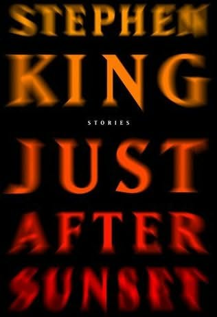


These books use indexes in a variety of ways. The book titled Speak has a face on the front without a mouth, this is an index showing perhaps the book is more about being silent or not being able to speak. The book Where the Sidewalk Ends is in black and white and drawing in a cartoon style. There are kids looking over the edge of a sidewalk. This is an index that the book will be light-hearted and perhaps childlike. The book entitled Burned actually has the letters burned into the book showing the book will be possibly be about hurt or fire.
Subscribe to:
Posts (Atom)